Fox & Ivy Online Launch
Tesco made the decision to introduce its own luxury home brand to rival the likes of John Lewis and Next. The name “Fox” coming from Sarah Fox. Who Jack Cohen, Tesco’s founder, married.
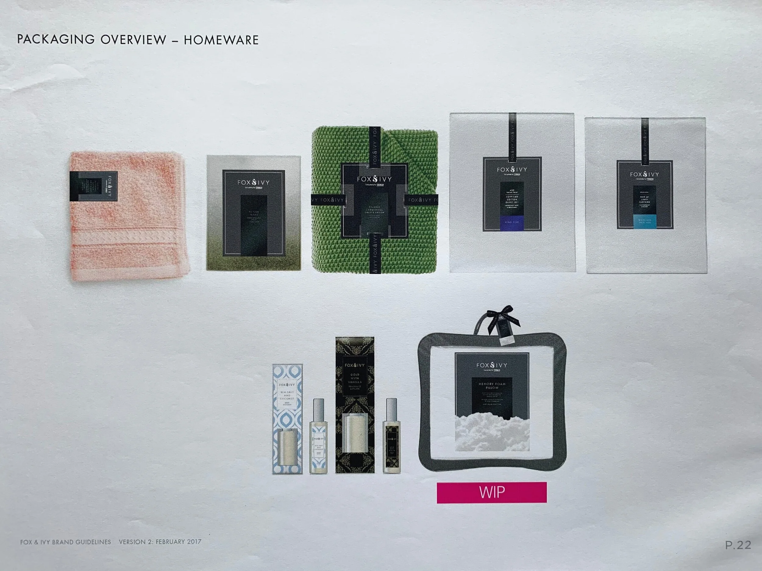
Naturally, selling product online can be harder than in store, because the potential customer dose not get to feel or see the products for themselves. The quality was above and beyond what Tesco has ever done before within its Home product. So I need to convey that in only text and imagery
Below is the story of how I project managed telling the Fox & Ivy online launch.
SPOILER: As you may or may not be aware, that the Tesco Direct website closed down in 2017 and moved all products on to tesco.com website. All product descriptions & content copied over. So whilst the below web pages no longer exist, its still very much a project I am proud of.
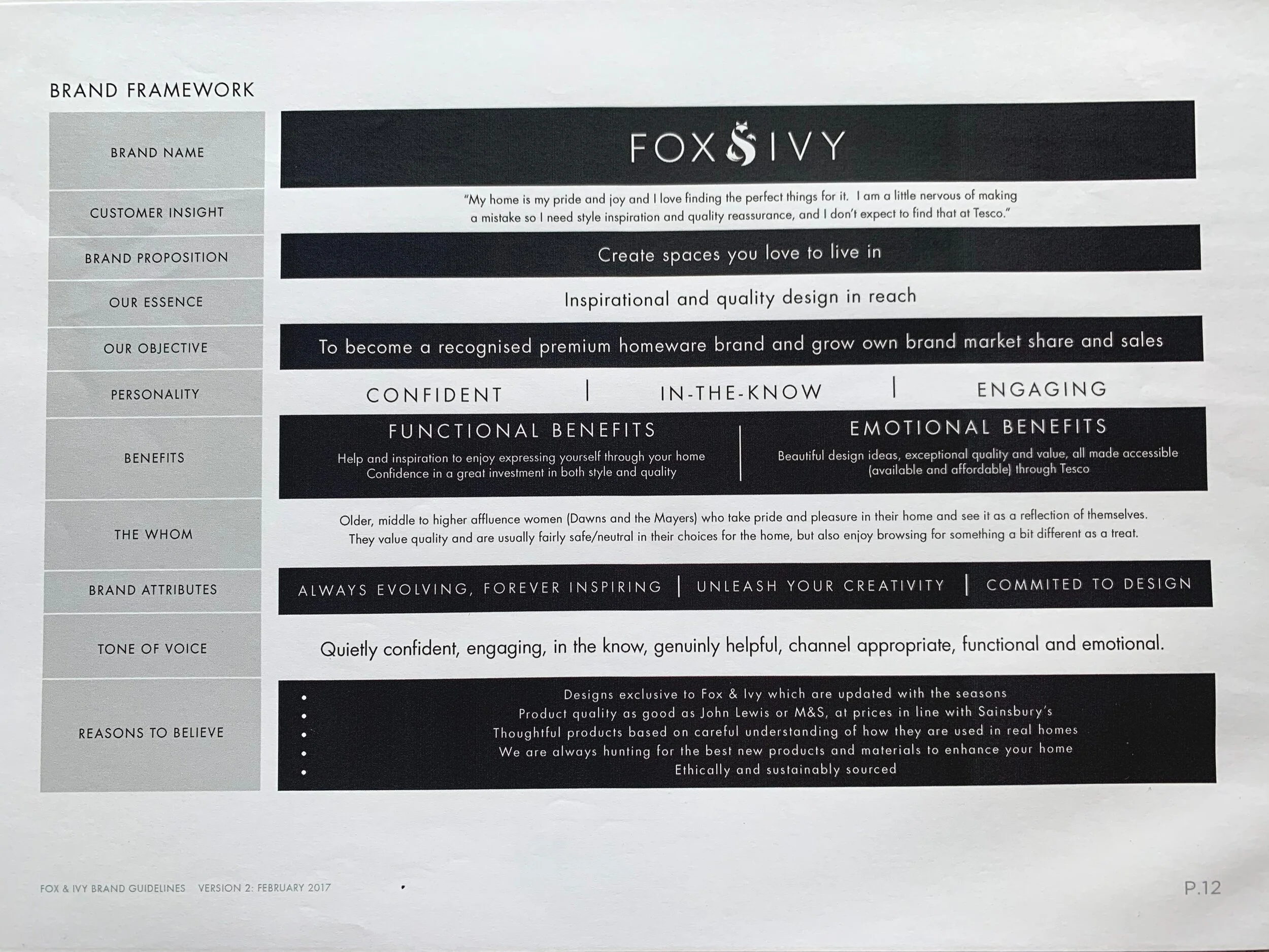
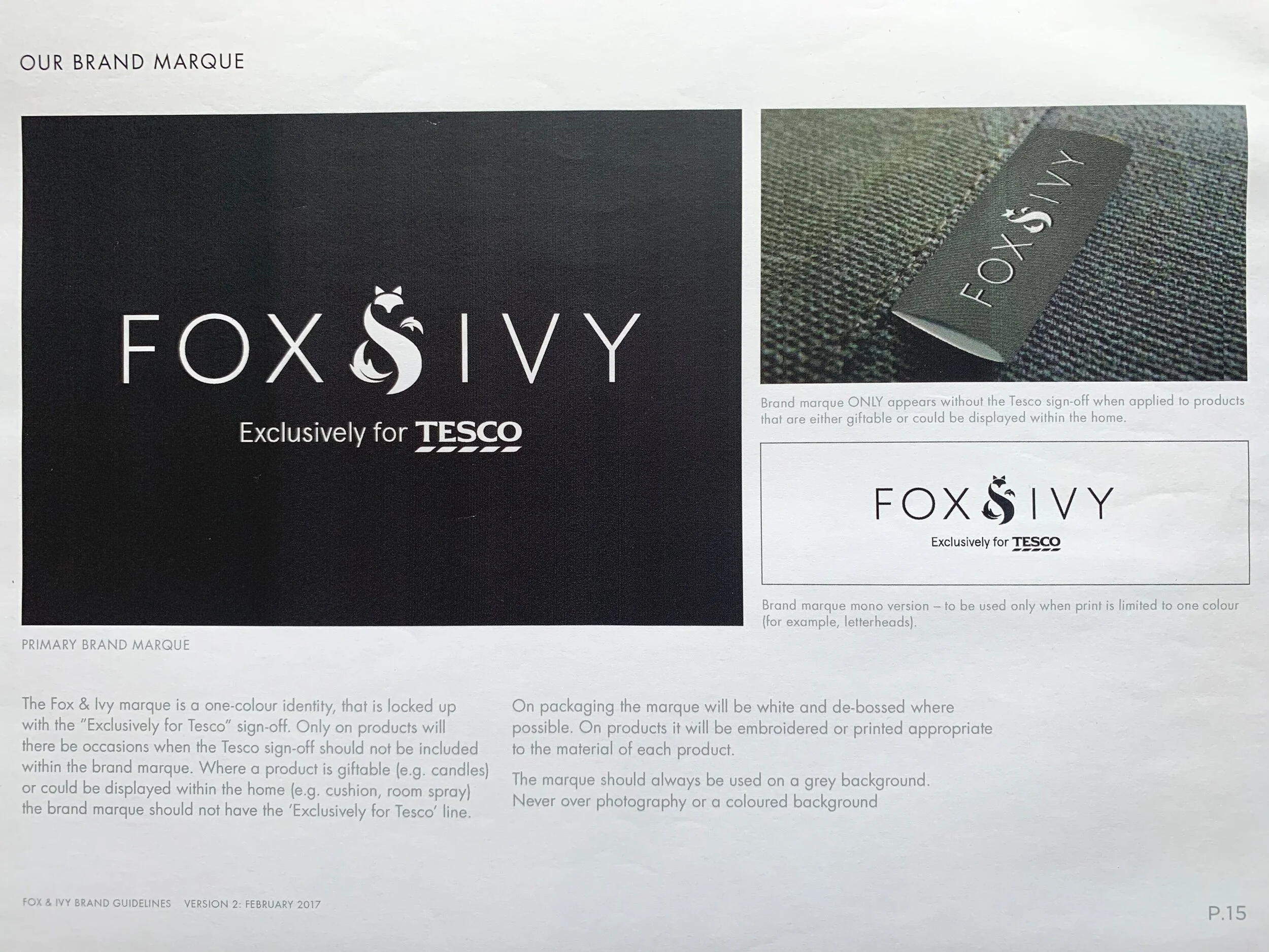
Understanding the brand
In order to confidently speak about these products I was invited to attend the NWTs. It was vital I knew exactly what this brand was about to represent it in the correct way online. I could also flag any concerns from an online point of view. Such as operational profitability etc. I spent time with the senior designer for Tesco’s, Steven Rowe to understand what other brands inspired him, so in turn, I could get inspired from their websites for my launch.
“Rodelle is a pleasure to work with. She is a very down-to-earth, hard-working and dedicated individual who learns fast and can slot straight into any team. She is more than capable of turning her hand to visual and creative work or to analytics and numbers, making a success of either.
When I managed Rodelle she was new to the world of digital & marketing, but the application she showed to upskill herself and make a success of the role was truly outstanding and a real credit to her. Thanks Rodelle, I really hope we get to work together again soon!”
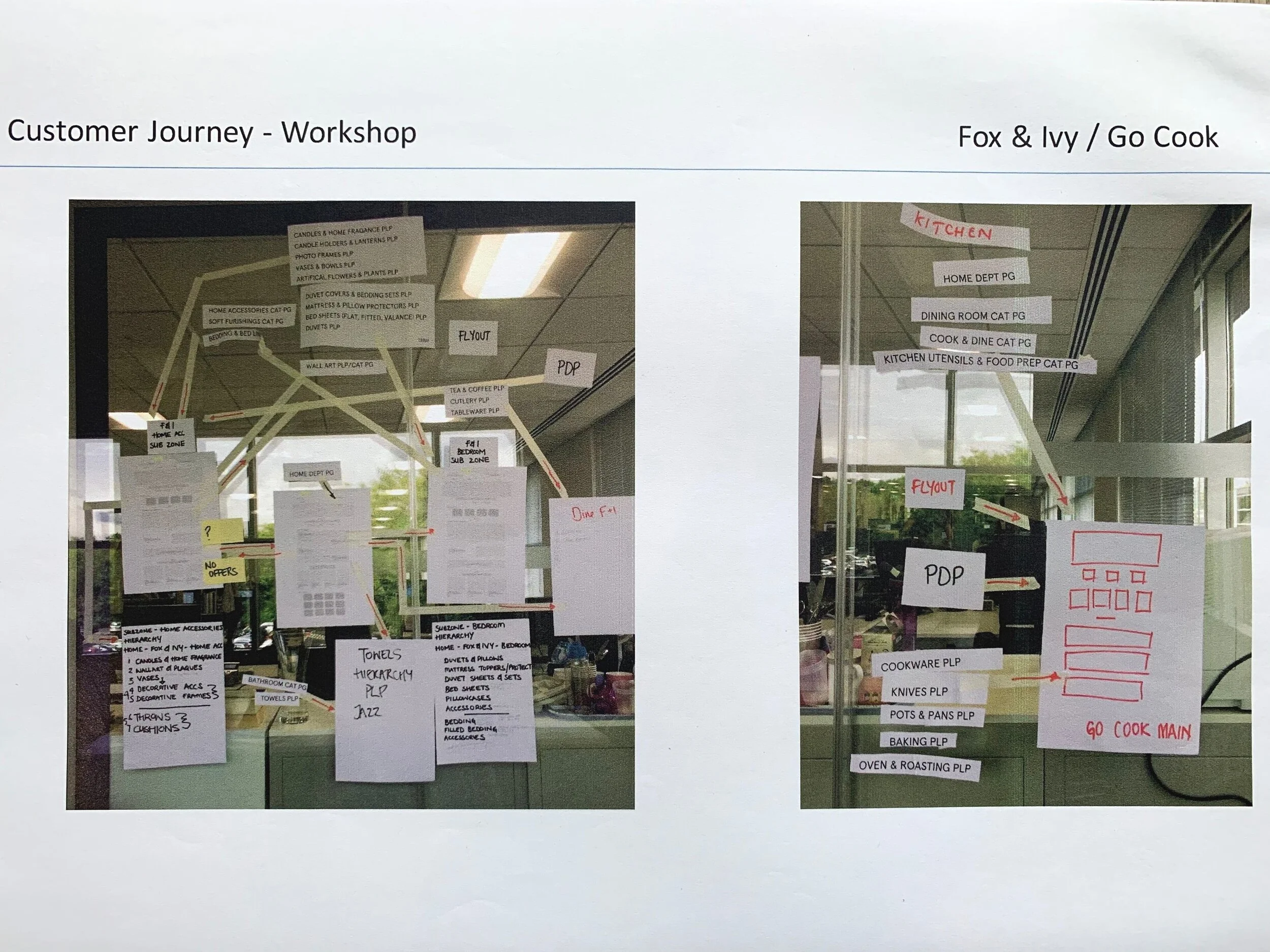
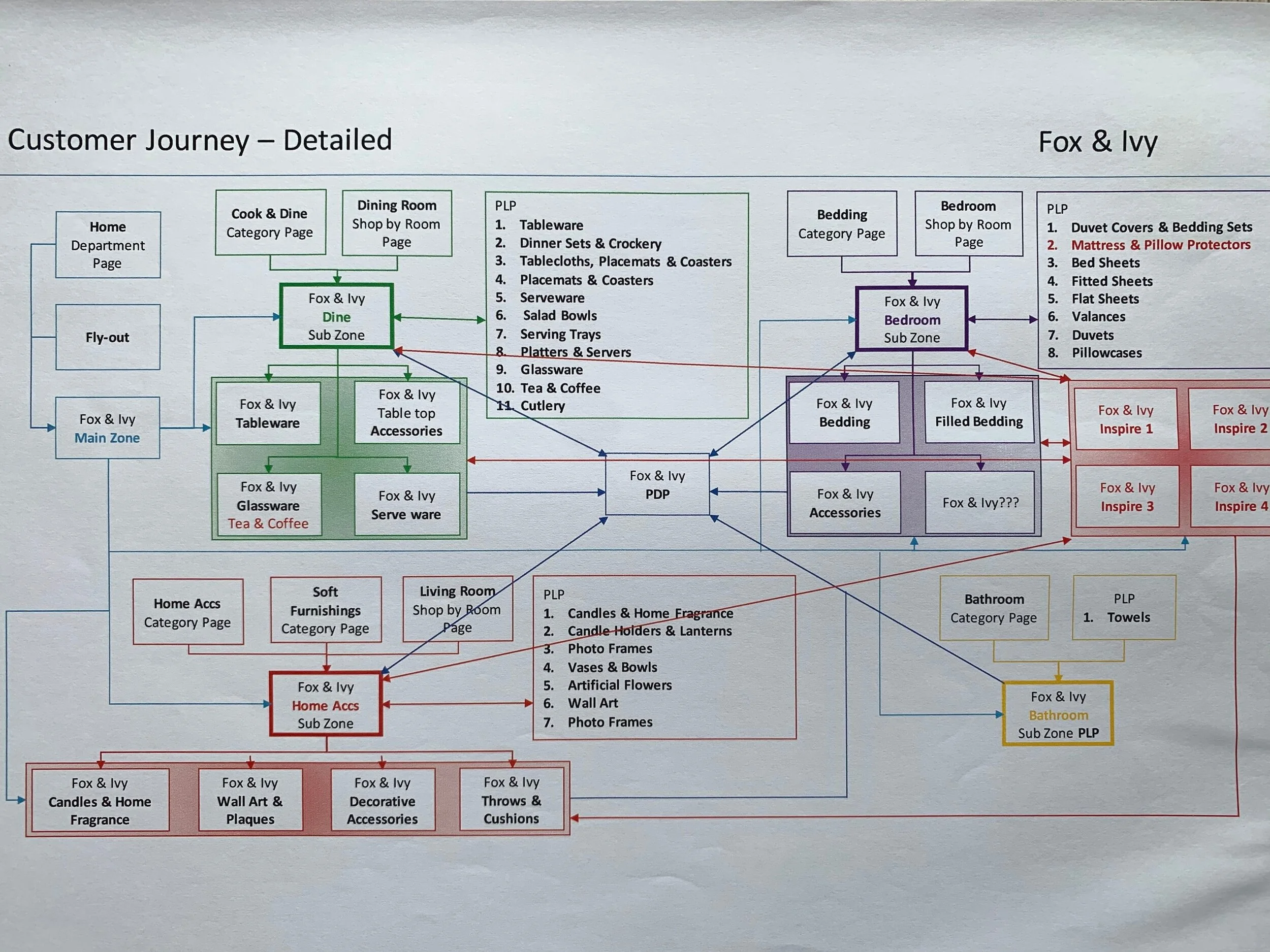
Taxonomy
Next up was mapping out the customer journey. I was conscious this part of the project would be very time consuming & take a lot of testing to get it correct. Eventually through testing, it was decided to place “bed & bath” together due to baths lack of product which didn’t feel right in a UX view to have its own page.
From left to right:
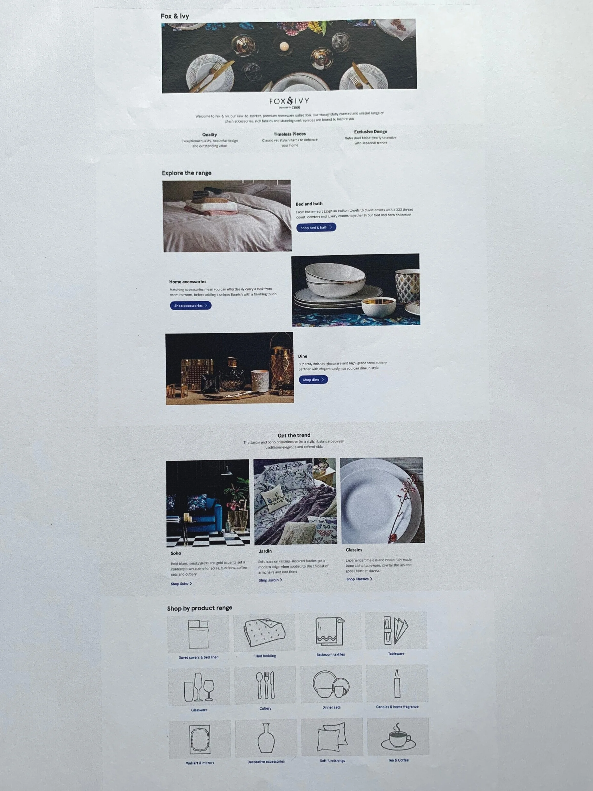
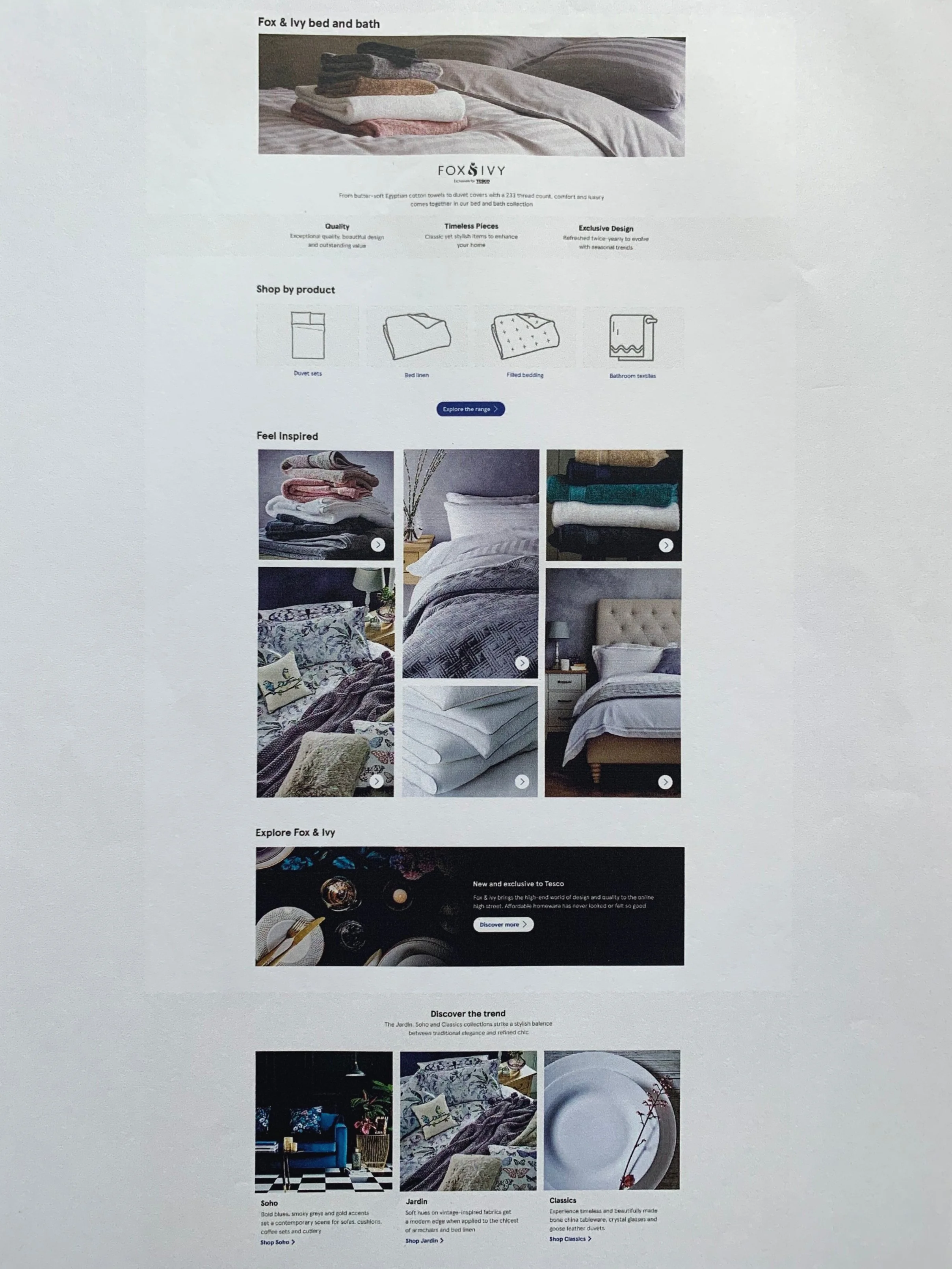
First is the home page. We wanted to show the breadth of product as soon as they land on this page. The icons towards the bottom of the page split out the product categories clearly. But further up the page, we kept it all very inspirational and split by room. The three side by side squares are what take you through the design trends.
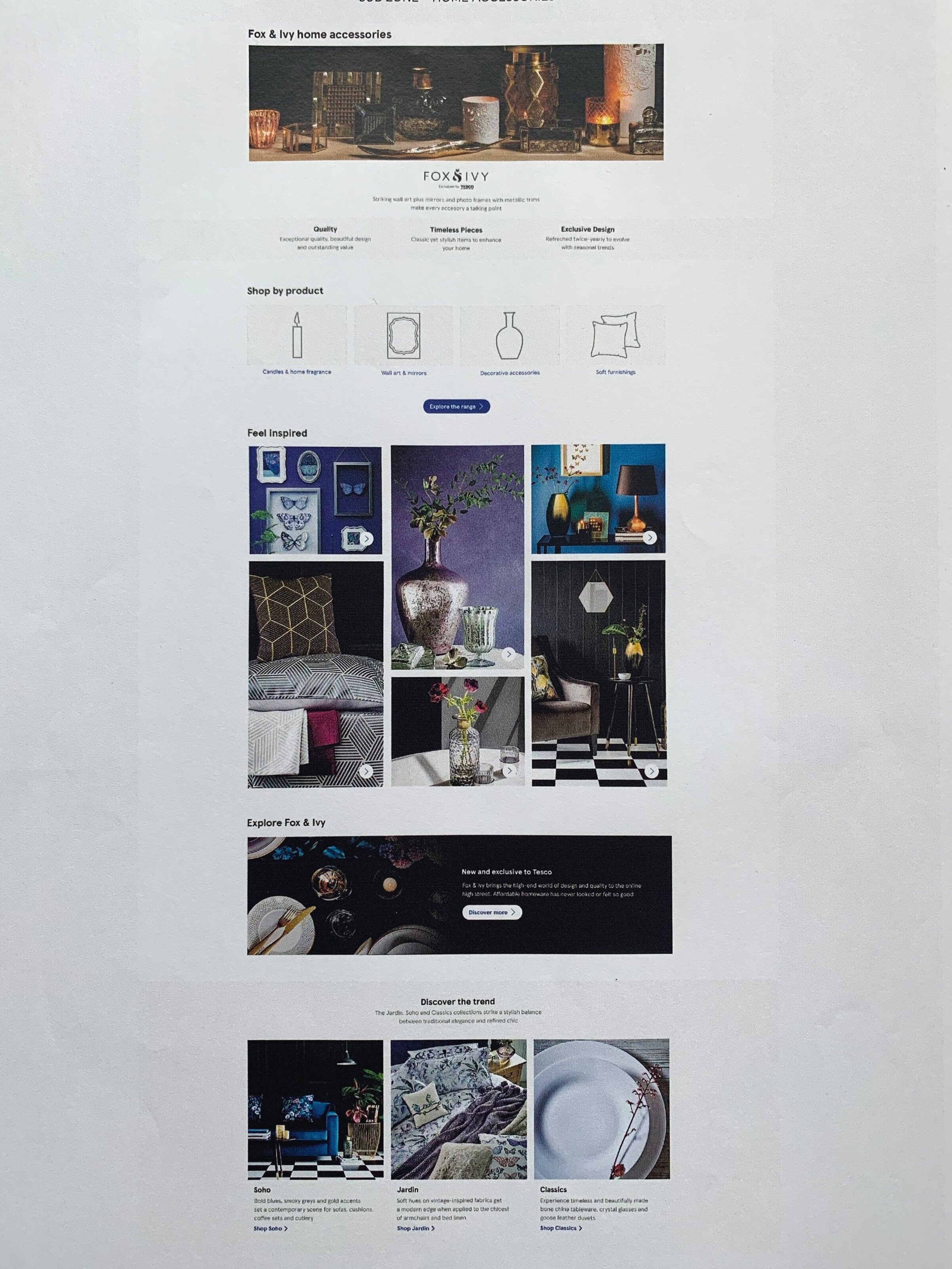
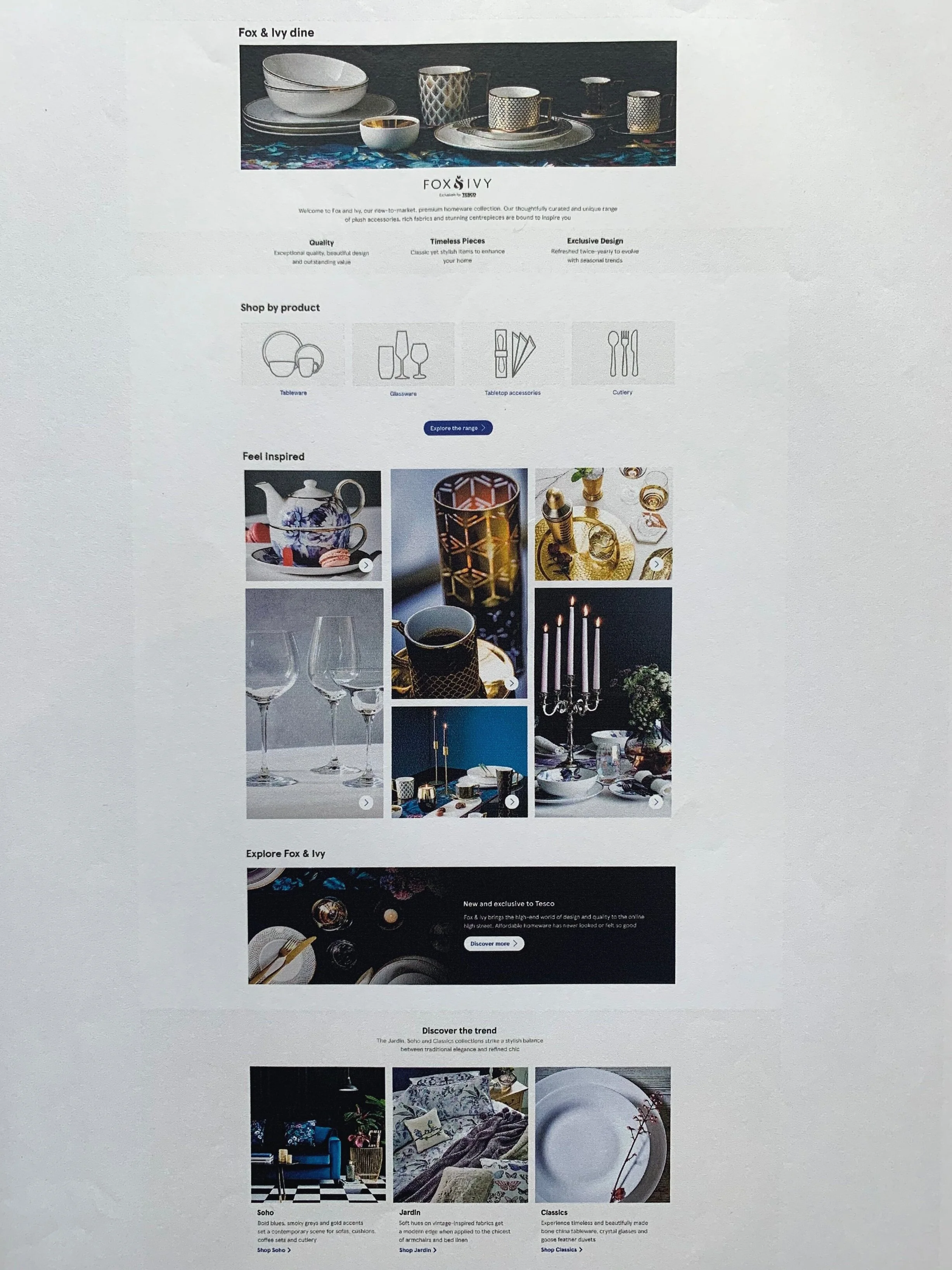
Next are the 3 sub pages, Home Accessories, Bed & Bath and Dine. All holding the same layout. Clear icons at the top, trend squares at the bottom.
The inspirational wall of pictures in the middle are what I called “shop the look”. This gave the consumer the chance to purchase all products featured this image as each clicked through to a personalised buylist. This module took some development as I wanted it built in to the site taxonomy to benefit from SEO & not be a temporary buylist used for events.
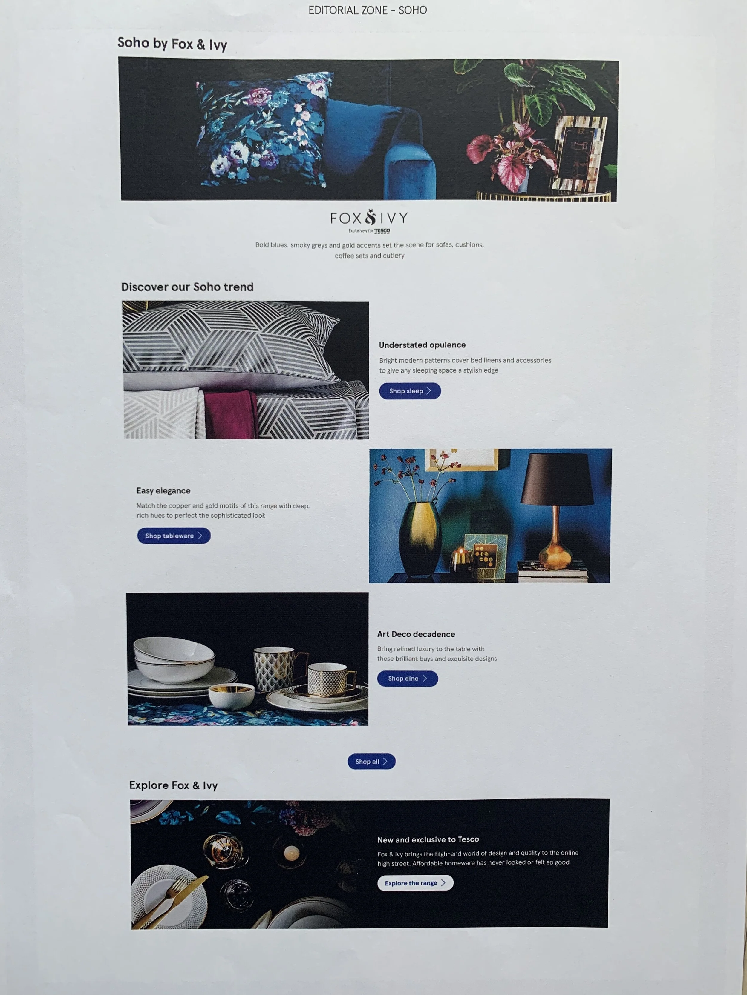
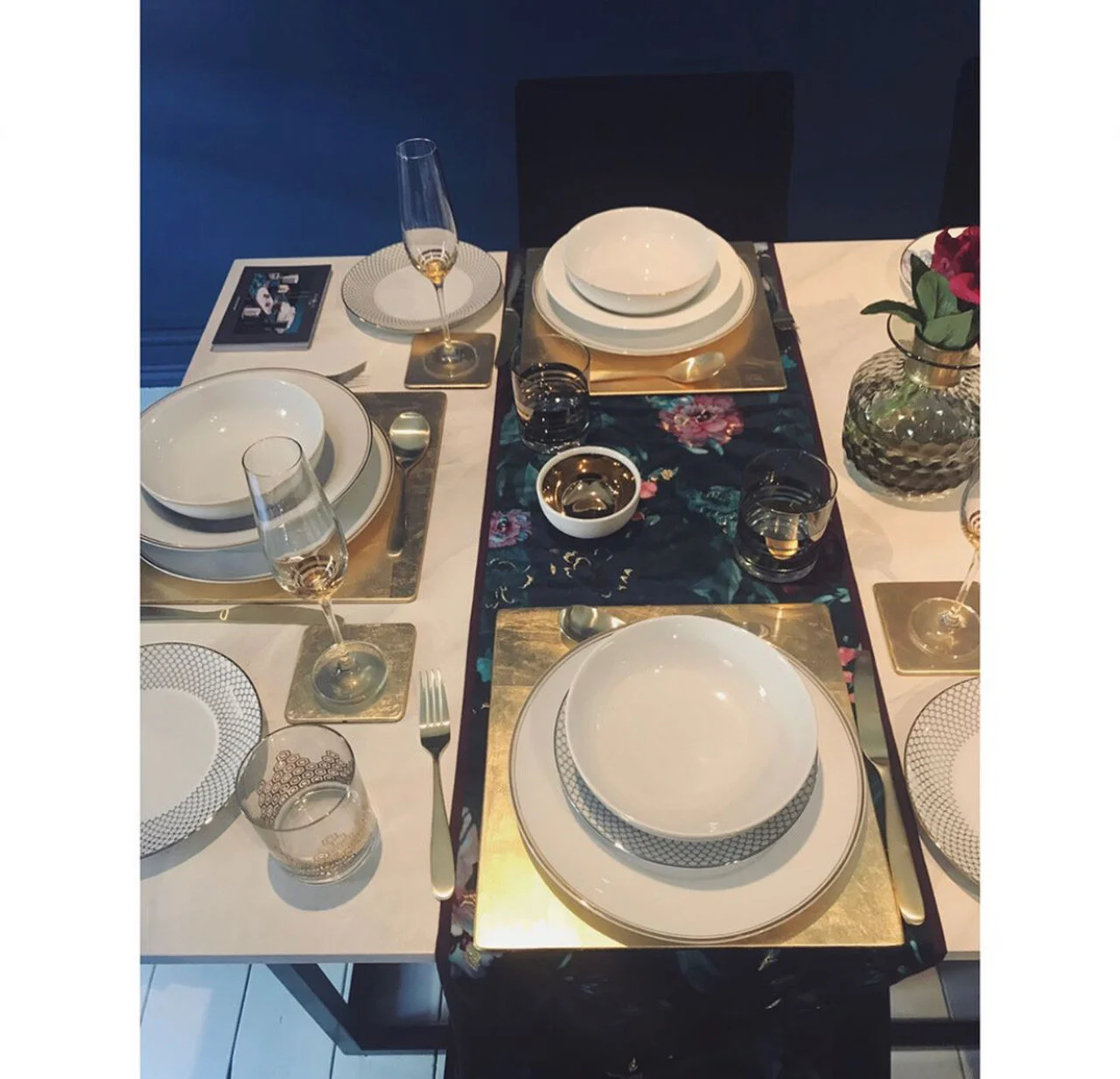
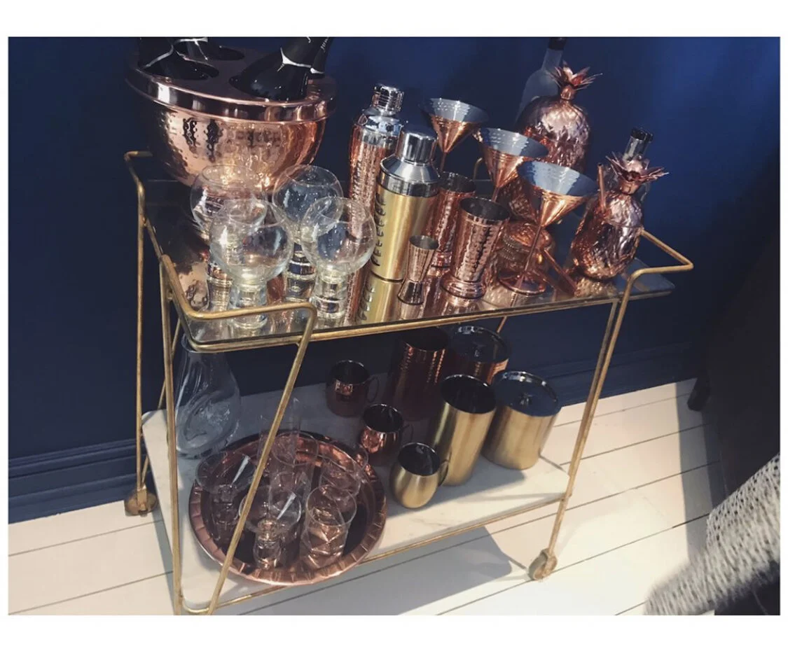
Soho trend
This trend was my favorite. A little more masculine out of the 3. A lot cleaner and sharper. Flashes of gold and strong lines, taking inspiration from art deco.
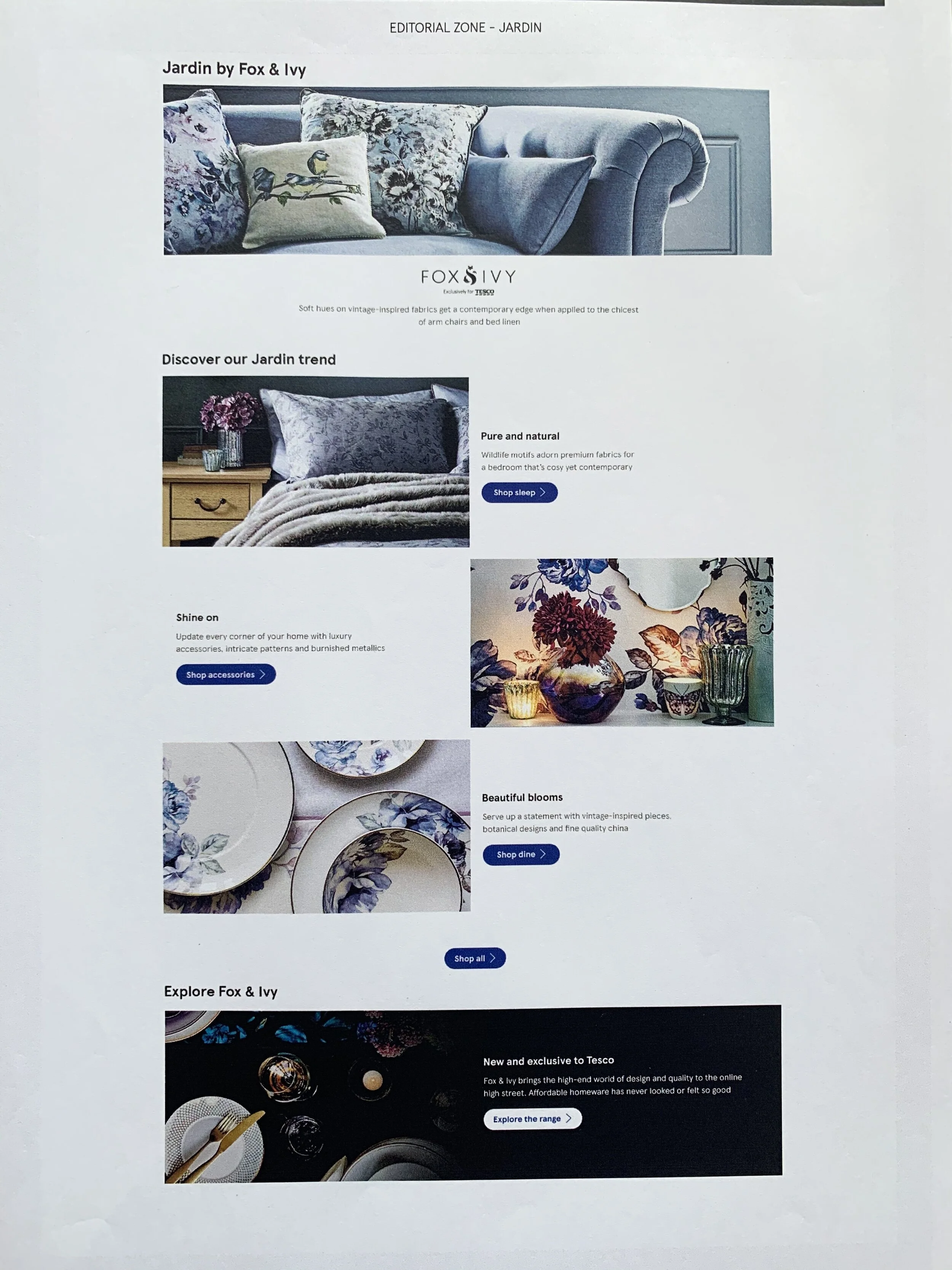
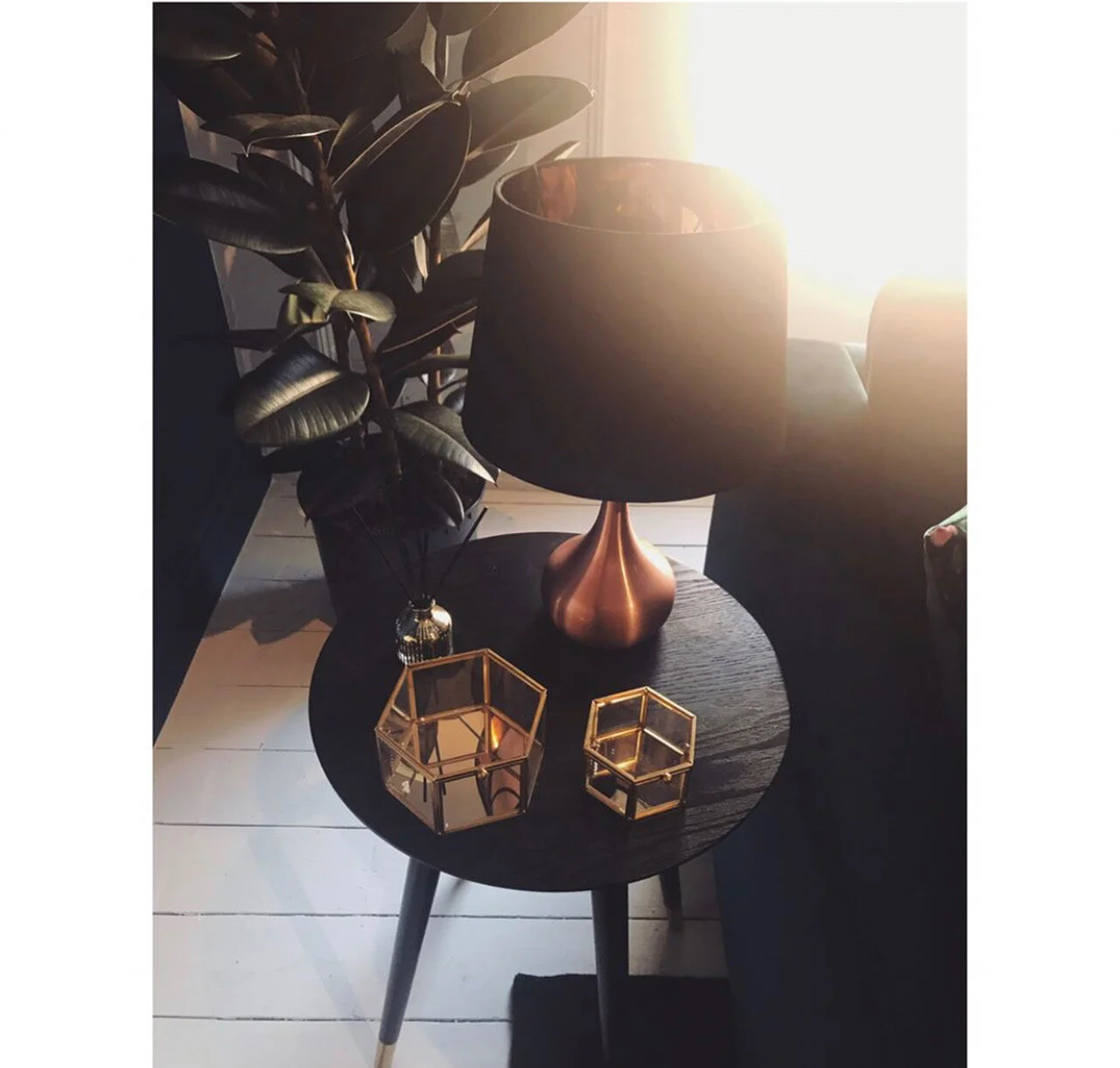
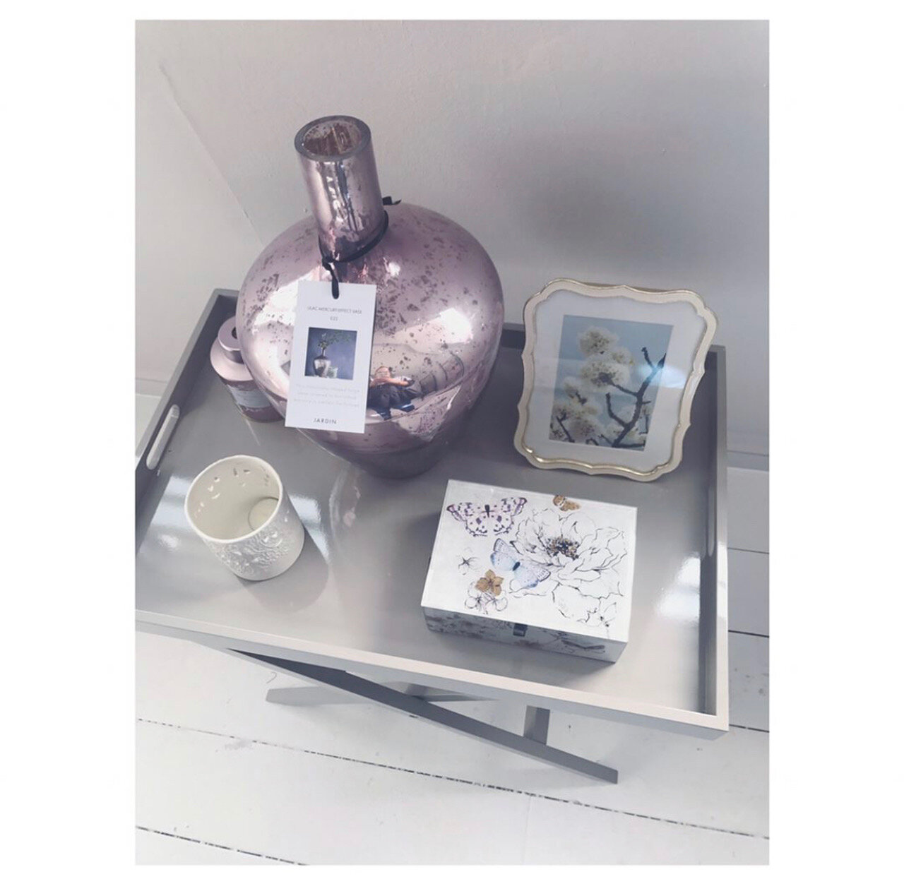
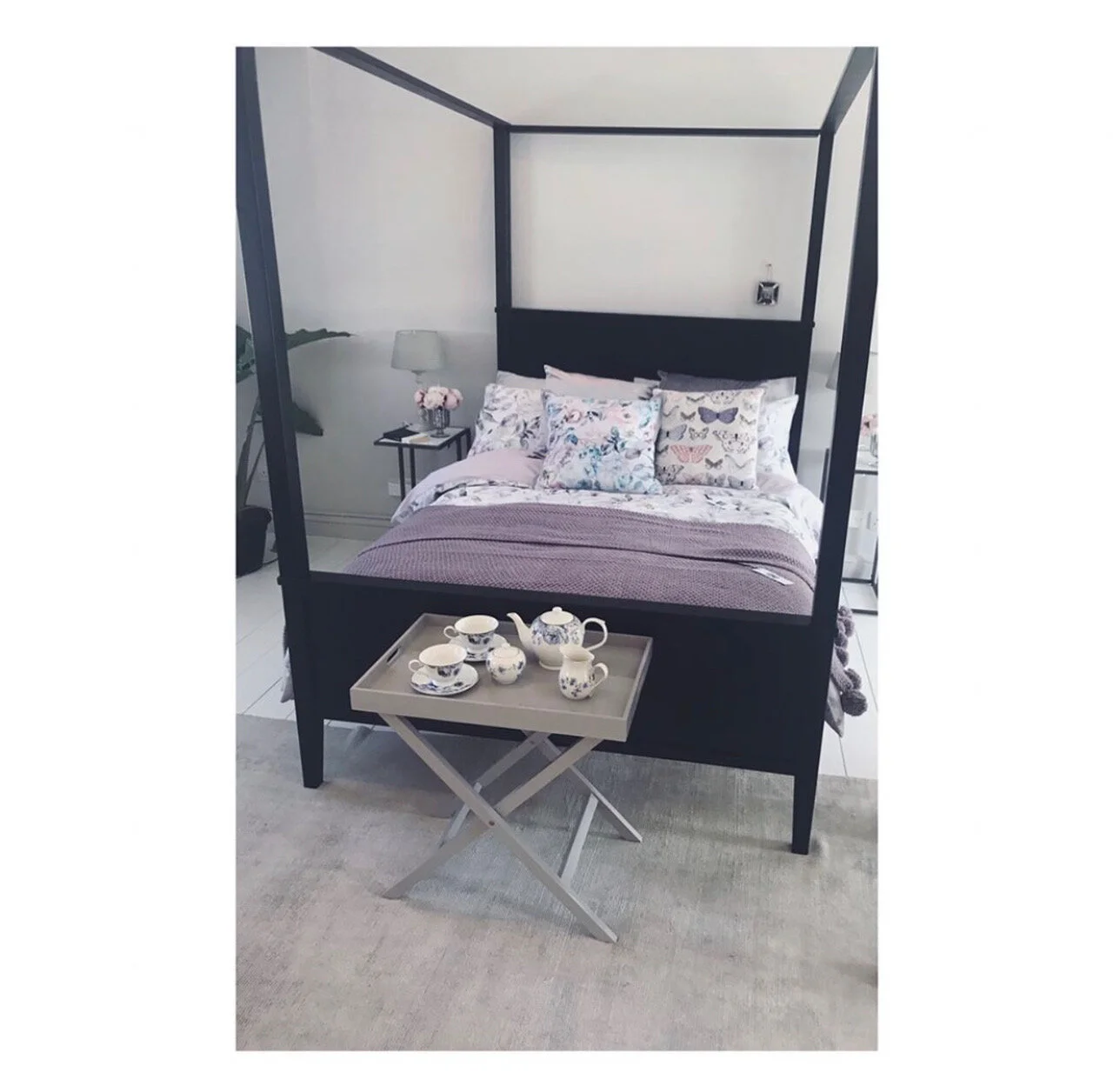
Jardin trend
This was our more feminine trend. With a a more vintage and cosey feel to it. Metallic accents of silver in keeping with with soft tones.
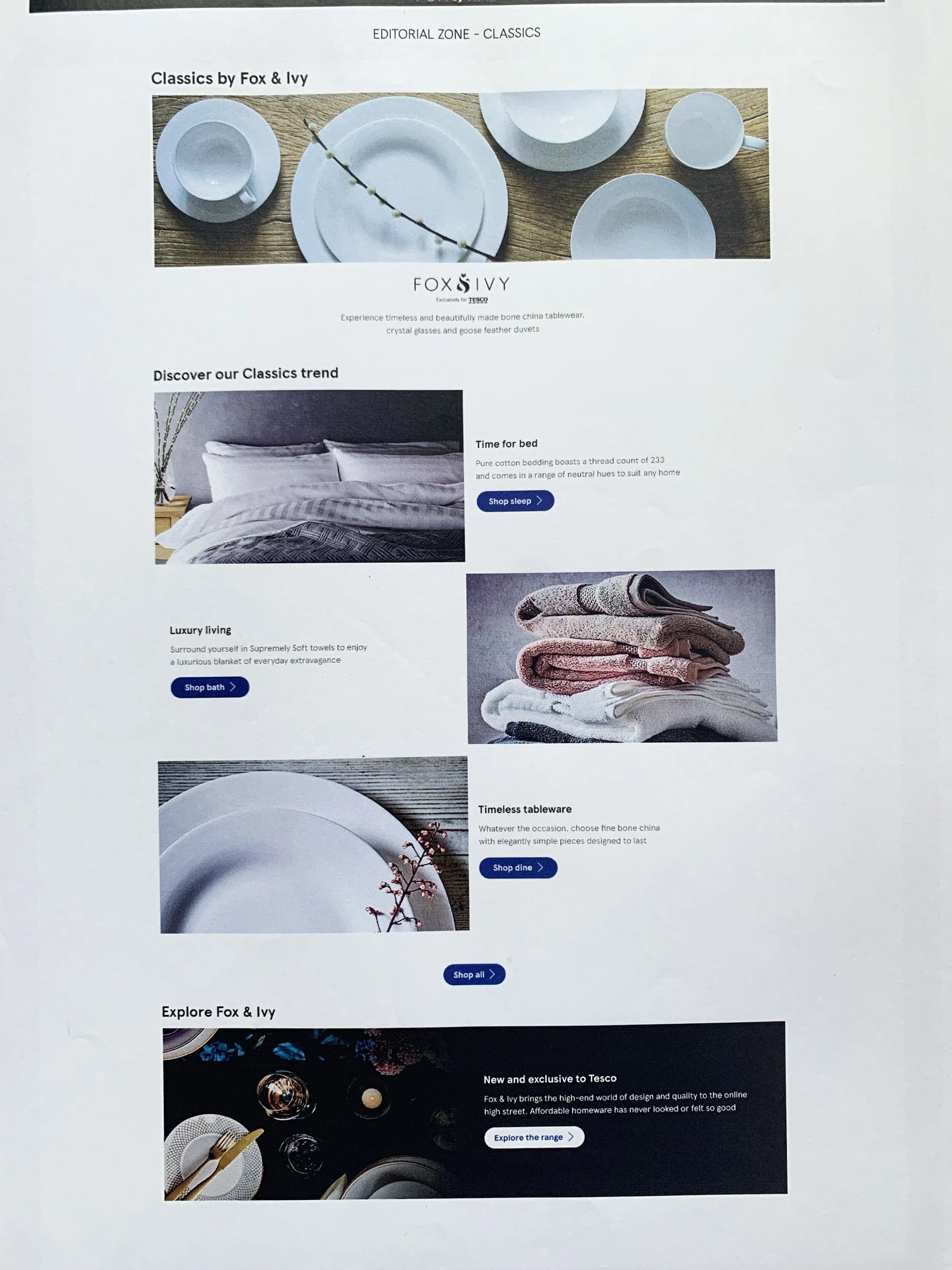
Classics trend
The classics is what it says on the tin. A selection of natural colors to slot in to any house. But still a premium quality product.
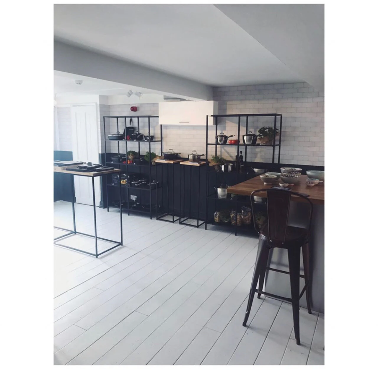
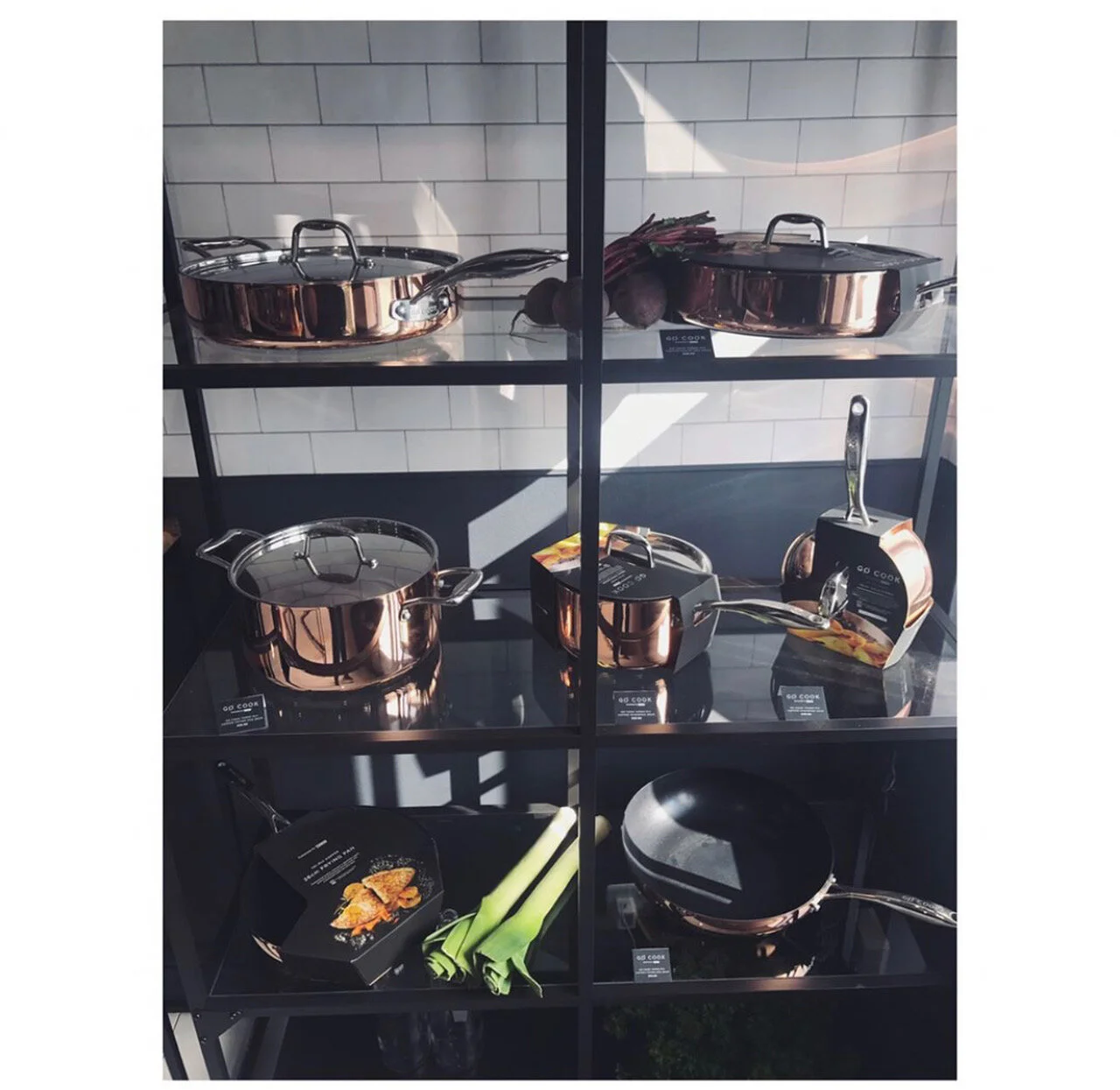
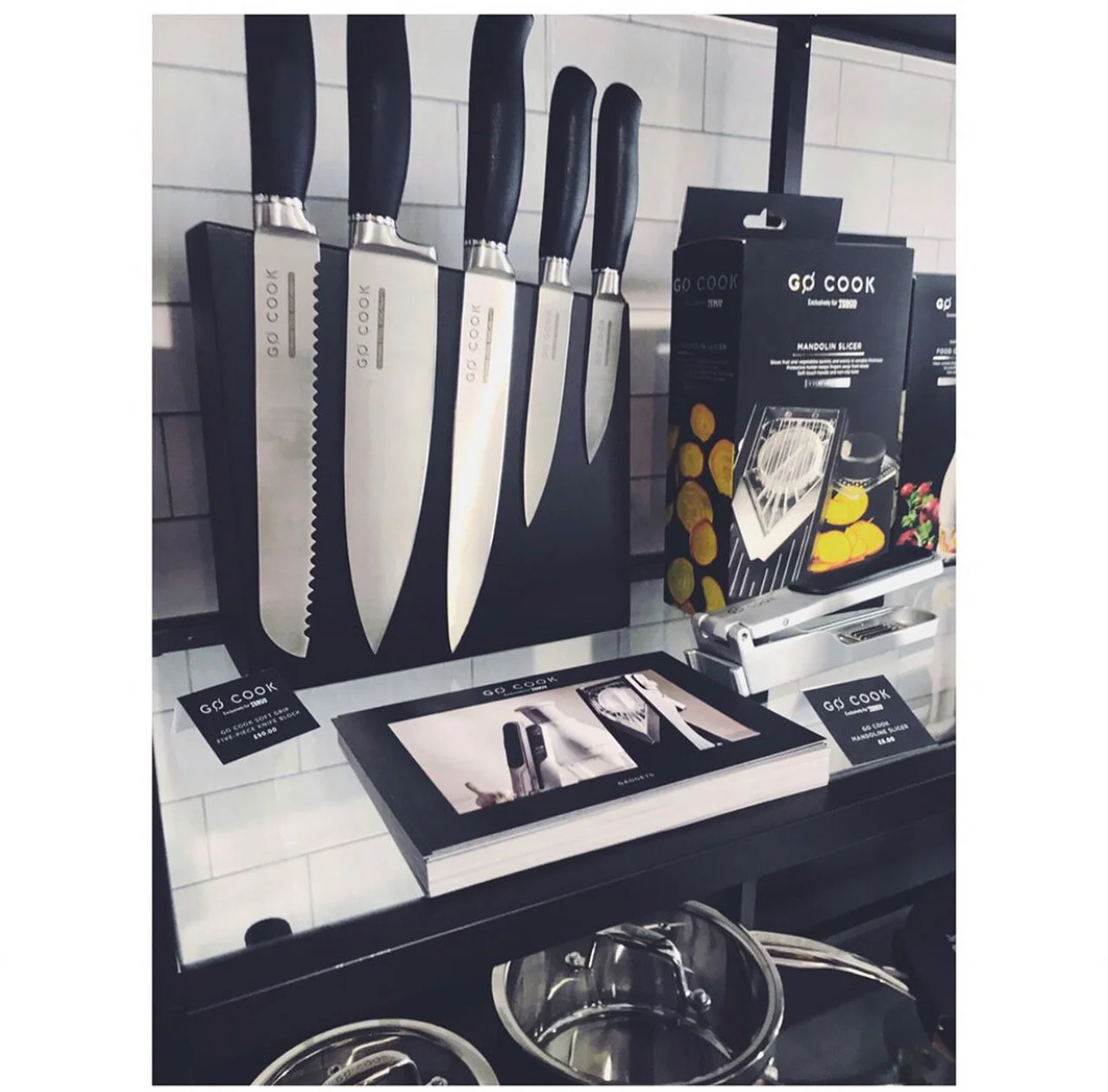
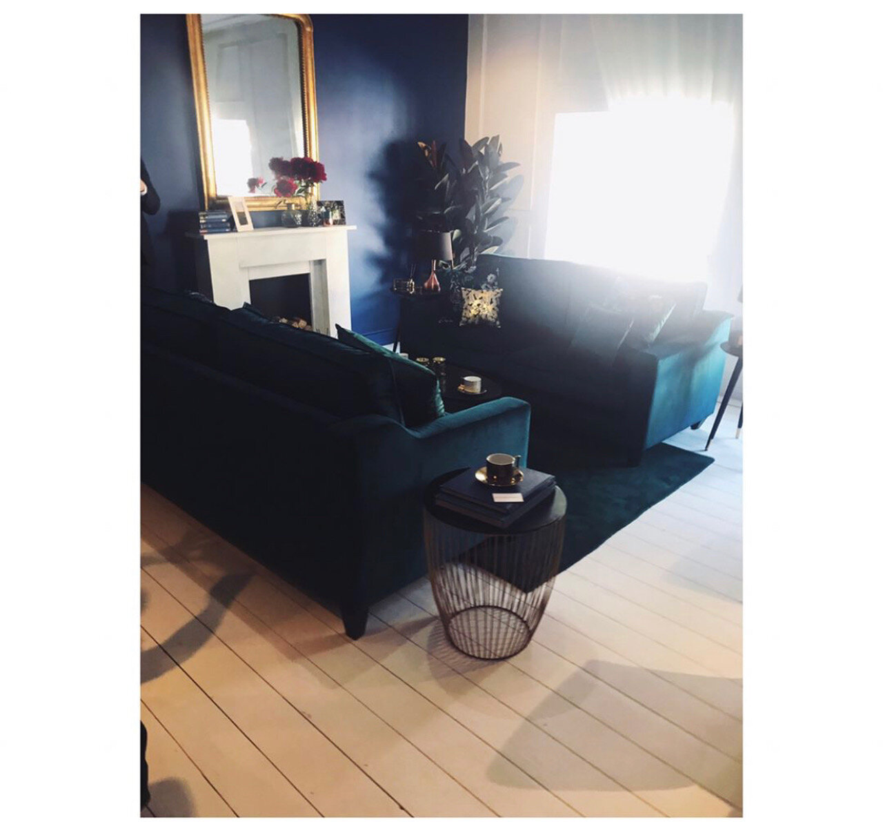
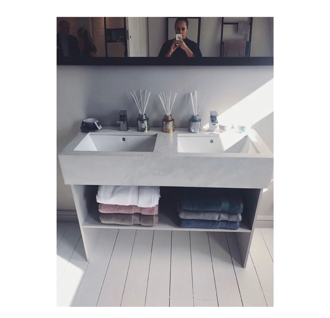
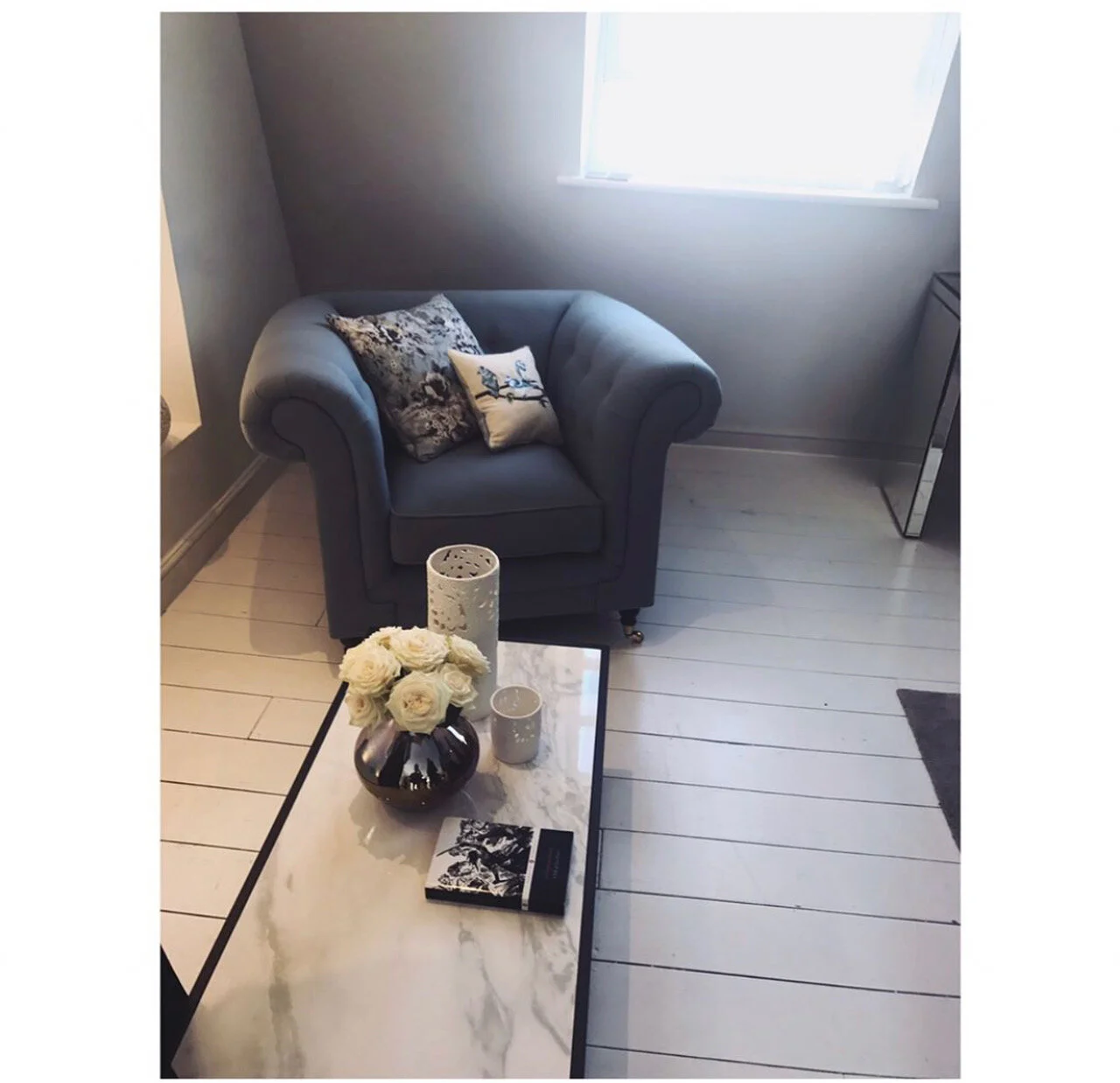
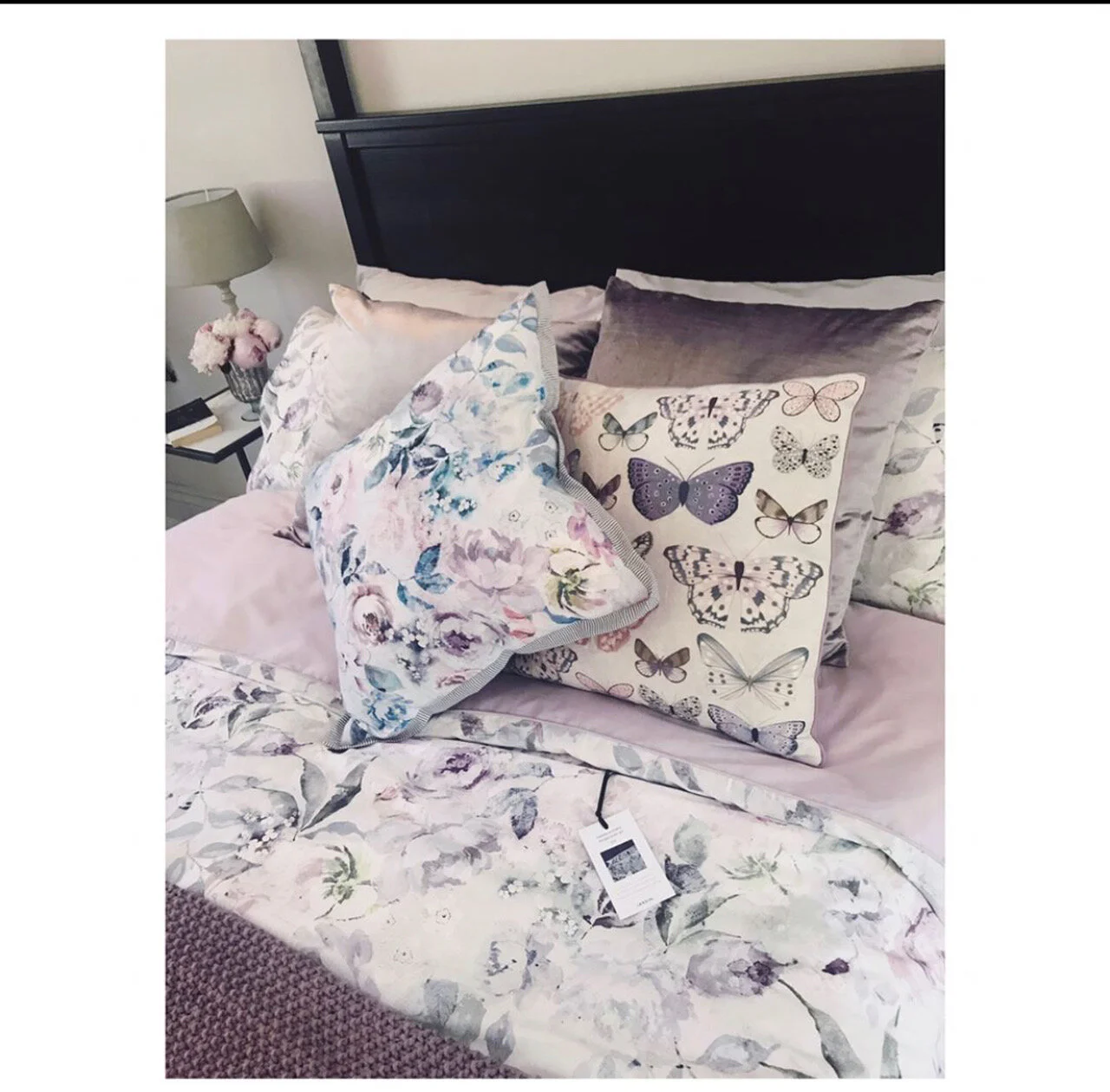
See slideshow below of the show home we took over in Soho for an activation event with press